The foundation of your digital marketing endeavors is rooted in your website. Crafting a superb user experience for it entails comprehending the challenges that varying visitors seek to address.
Your website has risen in its potential as a powerful tool. In the current marketing environment, it acts like a vigilant salesman readily available at all times. Thus, making your website an eminent asset for publicity and central to your promotional strategies.
Although your website may have been updated not so long ago, the fast-paced changes in digital trends can make it appear old-fashioned and outmoded. A complete redesign could be desirable under certain circumstances; nevertheless, you might lack either sufficient time or funds to undertake such an extensive venture. To address this issue effectively, we’ve assembled a collection of ten uncomplicated techniques to enhance your website’s utility and usability significantly.
1. Using attractive calls to action.
Your website users rely on visual cues to determine what content is relevant. Clear calls-to-action (CTAs) with action words enable easy navigation and help them find what they need quickly.
When creating buttons, keep in mind the significance of color psychology as illustrated by Maxymiser’s study which showed an 11% increase in clicks at Laura Ashley’s checkout area after testing different colors. Color choices may convey messages such as trustworthiness or intelligence so choose wisely based on your desired impact.
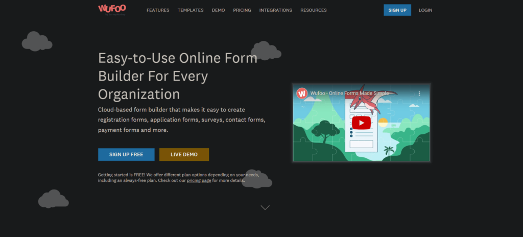
Additionally, use verbs or action-oriented language that motivates users to act when deciding button wording since emotional identification encourages interaction: timely and bold word choice can make all the difference for gaining traction with potential customers!
2. Using white space.
I’ve heard clients complain about the surplus of white space on their website and suggest utilizing it to advertise more services. However, good design requires an appropriate amount of white space to improve content readability and focus attention on surrounding elements. According to Crazy Egg, a 20% increase in user attention is achievable through the strategic incorporation of whitespace around text and titles.
Furthermore, effective use of whitespace can enhance brand consistency by conveying a modern aesthetic that reflects positively with users; though be mindful that too much may detract from valuable information shown above the fold (initial view without scrolling). Striking a balance between prioritized top communication surrounded by complementary visuals/text amplifies effectiveness while promoting proper web design principles.
3. Segmenting key information with bullet points.
Using bullet points allows users to quickly gather the information they need, such as product/service benefits and key features. This not only makes your proposals more appealing but also ensures that all necessary details are communicated efficiently. Rather than sticking with conventional circle bullets,
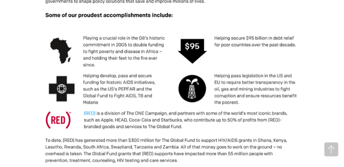
consider incorporating fun icons or images relevant to each point for added visual appeal and clarity of communication. By doing so, you can focus on conveying essential ideas without getting lost in technical jargon or unnecessary specifics.
4. Optimizing page speed.
Waiting too long for a webpage to load is one of the most frustrating experiences web users can encounter. As people access content from various mobile devices and platforms, they expect swift results when browsing online or watching TV on their laptops – slow page loading can be highly disruptive and exasperating, causing many users to abandon the experience altogether due to lack of time. According to Section.io statistics, even an additional five seconds’ delay in page loading could increase website bounce rates by over 20%.
To address these concerns, Google provides free services that allow you get information about your page speed while also suggesting ways in which it may improve across both desktops and mobile devices. One method available involves compressing all images before uploading them onto your site as large image files often contribute significantly towards slower speeds; websites such as compressor.io offer solutions capable dramatically speeding up each individual webpage you operate through compression techniques tailored specifically for this purpose.
5. Using images (wisely).
As internet users become more adept at evaluating company websites, the importance of making a positive first impression is greater than ever before. Visitors to your site can quickly spot stock photos that are used elsewhere or have an impersonal feel about them – which damages their trust in and perception of your business.
In order to improve conversions, it’s essential for companies to create images that speak directly and authentically to each visitor.A recent study by Spectrum Inc highlighted this point; simply swapping out generic placeholders with authentic team photographs increased user engagement considerably while simultaneously increasing brand confidence.It goes without saying that original imagery offers much deeper connections between businessesand potential customerscomparedtoeventhehighest qualitystockphotos.Rest assured,integrating well-chosen relevant visuals into website contentwill effectively balance text, creating interestwhile supporting the overall message conveyed through written copy.
Therefore,it seems sensible for brands touse such strategic visual assetsin supportoftheir messagingwhilst ensuring enthusiasm around what you do shines right through all core elements on display!
6. Keeping website pages consistent.
Consistency refers to ensuring that all aspects of your design match. This includes heading sizes, font selections, colors used, button styles, spacing between items on the page and other design elements such as illustrations or photographs. It is essential to maintain a consistent theme throughout your website’s pages in order for users navigating through it to have an enjoyable experience.
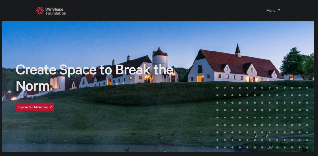
By providing consistency within site designs you can make sure visitors know they are still browsing your site while keeping them invested in what you offer.
If drastic changes occur from one page layout style compared with others confusion could arise among navigators making trust levels lower more likely for people who might leave after asking themselves questions like “Am I even at the right place?” Inconsistencies present across sites create negative impressions potentially leading audiences toward thinking there may be issues concerning quality support provided by companies’ offers services/products being marketed online.
7. Including well-designed and written headings.
To effectively reach your potential customers, it is crucial that you align both your headings and content with their needs. Incorporating relevant keywords in the title can also enhance targeting efforts and attract suitable audiences.
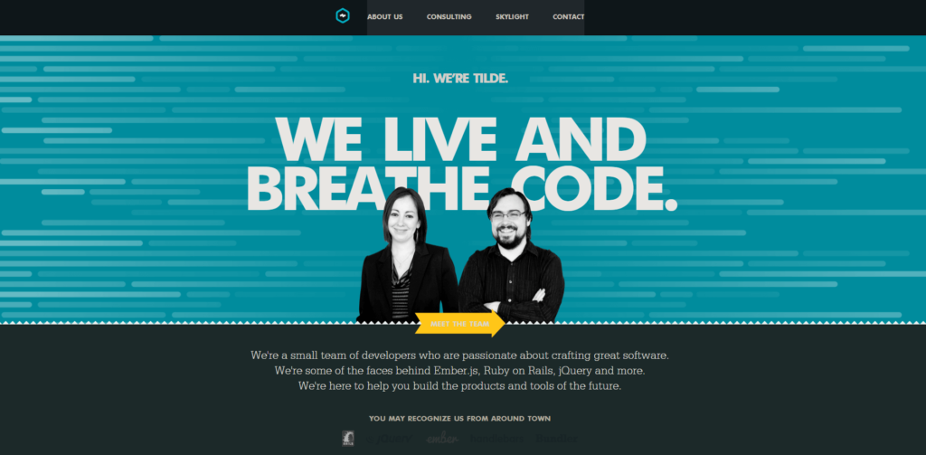
Since search engines tend to prioritize headlines over other text, careful selection of a standout heading could significantly boost visibility online. Beyond improving searchability, headings serve as signposts for site navigation – assisting users in scanning through pages quickly to find information tailored directly to them.
8. Catch your 404s
Although search engines may not heavily penalize you for soft 404 errors (page not found), it is important to note that users will. Visitors expect links and images on your website to guide them seamlessly through their desired tasks; encountering a 404 error page disrupts this process entirely, leading to annoyance and potential loss of interest in spending time on your site. A slow-loading webpage already creates frustration for the user, but experiencing multiple instances of 404s compounds this problem further.
To ensure that no such issues exist within your site’s structure, utilizing Google Webmaster tools or other free resources like a 404 checker can help identify any potentially problematic crawl errors. It’s essential as an online business owner or content creator always strive towards providing optimal UX design experience while reducing setbacks encountered by users during browsing sessions!
9. Using hyperlink differentiation.
By adding a hyperlink to a page, it implies that you want the user to follow through and click on it. To ensure links are easy for users to identify, use visual cues such as underlined or differently colored text. Research conducted by Karyn Graves shows blue and underlined text is commonly identified as clickable links amongst regular web users. Utilizing established conventions can be advantageous in meeting user expectations and achieving success online.
To differentiate hyperlinks effectively, there’s no need for reinvention of the wheel; sticking with convention may prove beneficial. A simple way of testing link effectiveness is by blurring them out while removing any color from their design- this lets you assess what stands out best.
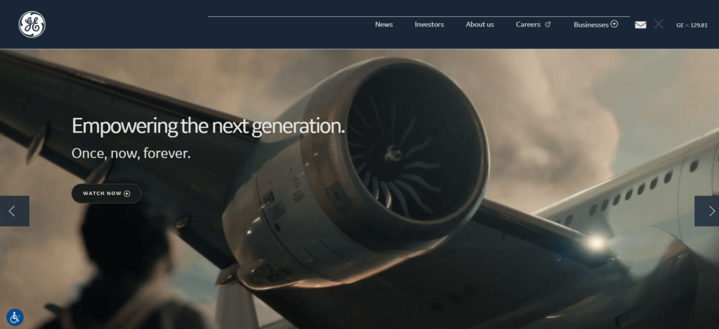
Always pause when hyperlinking content: take into consideration how lengthy your titles are – longer ones tend towards more effortless readability/identification by readership).
Being responsive & mobile-friendly.
With the advancement of technology, mobility has become a crucial element for most individuals. This includes websites which have played an integral role in this evolution. Ensuring that your website is both easy to navigate and mobile-friendly regardless of device type is essential.
Recently, Google introduced penalties for non-responsive sites highlighting the utmost importance of responsiveness in our digital age. The optimization process will significantly enhance usability – arguably one of its greatest advantages yet! You may use a free tool if unsure about whether or not your site meets these standards.
By following some practical tips provided above, upscaling user-friendliness on your website perhaps would no longer require complete redevelopment but still offer effective results! If you desire further examples showcasing useful oNline platforms we recommend checking out our guide below – available at absolutely zero cost to access.
